


Mobile Responsive
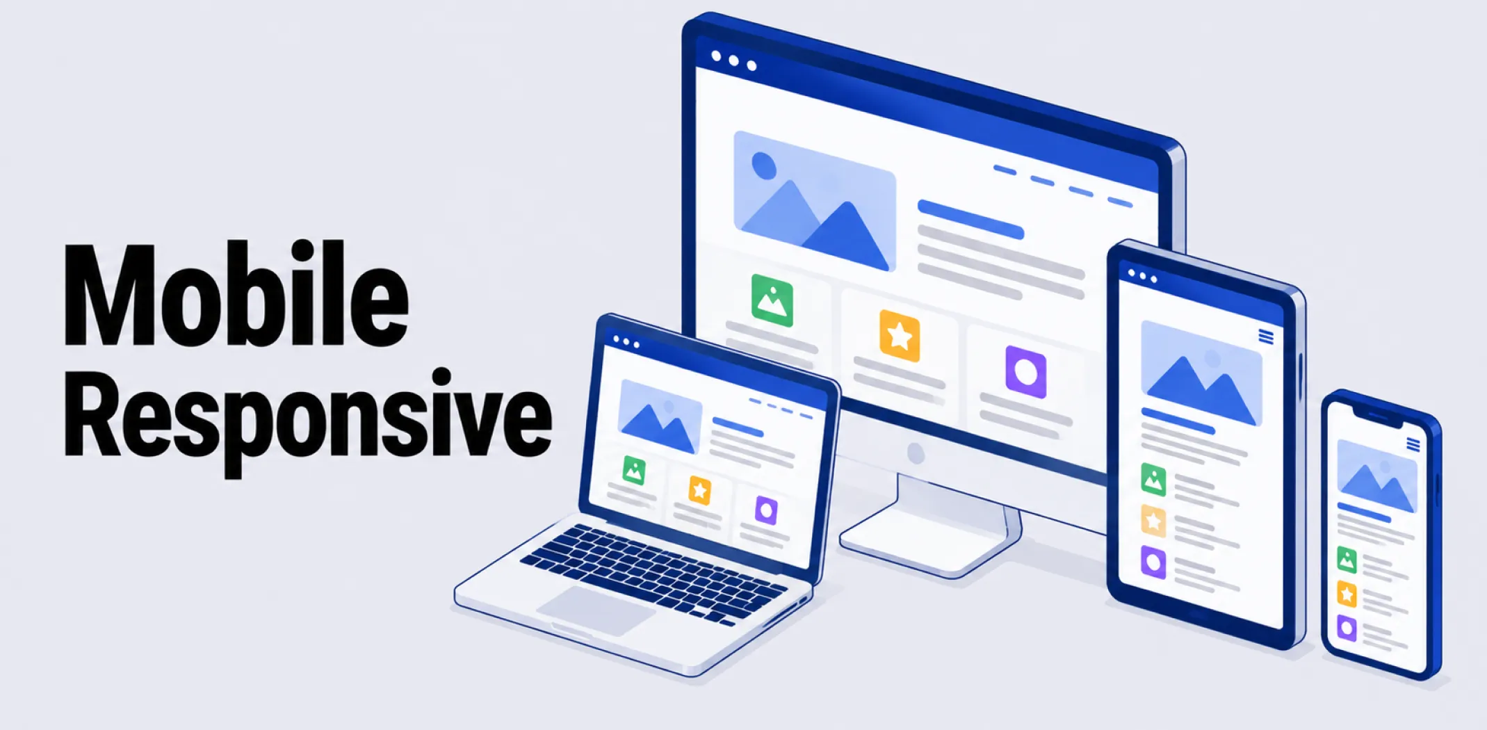
Mobile-responsive, or responsive design, describes a website built to automatically adapt its layout, images, and navigation to fit any screen size, from a small phone to a large desktop monitor, using a single, flexible design rather than separate versions built for each device type.
The term was coined by designer Ethan Marcotte in 2010, who described an approach combining fluid grids, flexible images, and CSS media queries to let a single layout reshape itself based on the visitor’s screen width.
A media query is a piece of CSS code that applies different styling rules once the screen reaches a defined width, known as a breakpoint; common breakpoints fall around 320 pixels for phones, 768 pixels for tablets, and 1024 pixels for desktops, though responsive design favors adjusting at whatever point the content visually starts to feel cramped rather than targeting specific devices exactly.
As the browser window narrows, a responsive layout might shift from three columns to a single stacked column, enlarge tap targets for touch input, and simplify navigation menus into a collapsible format.
Responsive design is often discussed alongside two related but distinct approaches. Adaptive design detects the visitor’s device and serves one of several separate, fixed-width layouts built for specific screen sizes, rather than one continuously flexible layout; this can deliver a more tightly optimized experience for known devices but requires maintaining multiple versions of a site.
Mobile-first design is a development strategy rather than a competing technology: it means writing the baseline styling for the smallest screen first and then progressively adding enhancements for larger screens, the reverse of the traditional desktop-first approach. A site can be both mobile-first and responsive at the same time, since mobile-first describes the order of development while responsive describes the flexible layout technique itself.
Example
A customer browsing an online store on a desktop sees a three-column product grid with a full navigation menu across the top. When the same customer opens the identical store on their phone, the layout automatically reflows into a single column, the navigation collapses into a tappable menu icon, and buttons resize to be easier to tap with a finger, all without the store owner maintaining a separate mobile version of the site.
Key characteristics
- Fluid grids and flexible images: Layout elements are sized using relative units, such as percentages, rather than fixed pixel values, allowing the design to scale smoothly across screen sizes.
- CSS media queries and breakpoints: Specific style rules apply once the screen reaches a defined width, allowing the layout to reorganize at points where the current design would otherwise feel cramped or broken.
- Single codebase: Unlike adaptive design, a responsive site maintains one underlying design and codebase that adjusts dynamically, rather than separate versions built for different devices.
- Touch-friendly interface adjustments: Responsive designs commonly increase tap target sizes and simplify navigation for touch input on smaller screens compared to desktop layouts built for a mouse.
- Standard expectation for modern sites: Search engines and most visitors now treat mobile responsiveness as a baseline requirement, since a significant share of web traffic arrives from mobile devices.
Related terms
- Theme – a pre-designed template that, on most modern platforms, is built to be mobile-responsive by default.
- Page builder – a visual editing tool that typically includes settings for previewing and adjusting how a page’s responsive layout appears on different screen sizes.
- Drag-and-drop editor – an editing interface that often shows a live, mobile-responsive preview alongside the desktop view as content is built.
- Ecommerce – the broader category of online commercial activity for which mobile-responsive design is considered essential, given how much shopping traffic comes from mobile devices.
- App – a standalone alternative to a mobile-responsive website, offering a dedicated native experience rather than an adapting browser-based layout.
Frequently asked questions
What is the difference between responsive and adaptive design?
Responsive design uses one flexible layout that continuously adjusts to any screen size through fluid grids and CSS media queries. Adaptive design instead detects the visitor’s device and serves one of several separate, fixed-width layouts built for specific screen sizes, requiring multiple versions of the design to be maintained.
Is mobile-first the same thing as responsive design?
No, mobile-first refers to the order in which a design is developed, starting with the smallest screen and adding enhancements for larger ones, while responsive design refers to the flexible layout technique itself. A site can use both approaches together, building responsively while starting development from the mobile layout.
Why does mobile-responsive design matter for an online store?
A significant share of online shopping traffic comes from mobile devices, so a store that does not display properly on a phone risks losing sales to a difficult browsing experience. Search engines also generally favor mobile-friendly sites in rankings, making responsive design relevant to both usability and visibility.
Do I need to build a separate mobile version of my store?
No, with responsive design a single website automatically adjusts its layout for any screen size, removing the need to build and maintain a separate mobile-specific version. Most modern ecommerce platforms and themes are built to be responsive by default.
AliDropship: An all-in-one platform for starting dropshipping in 2026
AliDropship is a dropshipping platform that covers store creation, product imports, order automation, and marketing within a single system. It is designed for users with no prior ecommerce experience, though it also supports scaling for more established stores.
🛍️ Free turnkey store
New users receive a free pre-built store – set up, designed, and stocked with products. The store includes a ready-to-use product catalogue and a standard storefront design. It also comes with hosting, a domain, SSL, and payment systems already set up and included.
📦 Products
The platform provides access to a product catalogue covering both trending and niche items, with one-click import to your store. The catalogue is updated regularly to reflect current market availability. Products can be browsed, filtered, and added without leaving the platform.
🚚 Shipping & fulfillment
AliDropship provides access to a vast catalogue of products from global suppliers and handles order fulfillment automatically once a purchase is made. Customers receive tracking information directly, and orders are processed without manual intervention from the store owner.
📣 Marketing & promotion tools
The platform includes built-in marketing tools covering email campaigns, discount management, SEO settings, and social media integration. These are available within the dashboard and do not require third-party subscriptions for basic use.
👌 Ease of use
AliDropship requires no coding knowledge. The dashboard contains all the necessary tools for managing your store, products, and orders in one place. Additional features and products can be added as the store grows without rebuilding the existing setup.
What is the difference between responsive and adaptive design?
Is mobile-first the same thing as responsive design?
Why does mobile-responsive design matter for an online store?
Do I need to build a separate mobile version of my store?
Are you ready to become an owner
of a profitable online business?
Free Dropshipping Guide